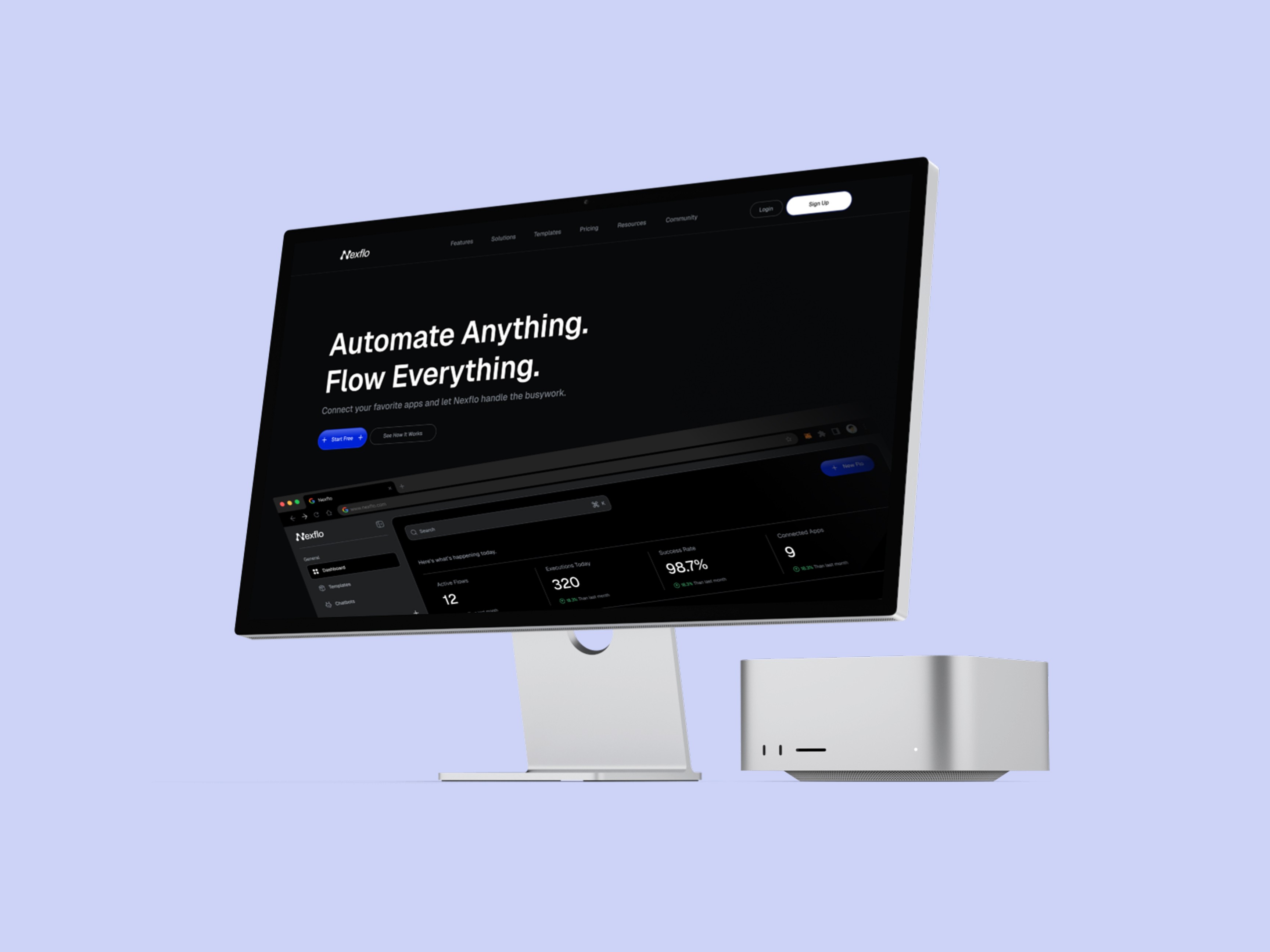
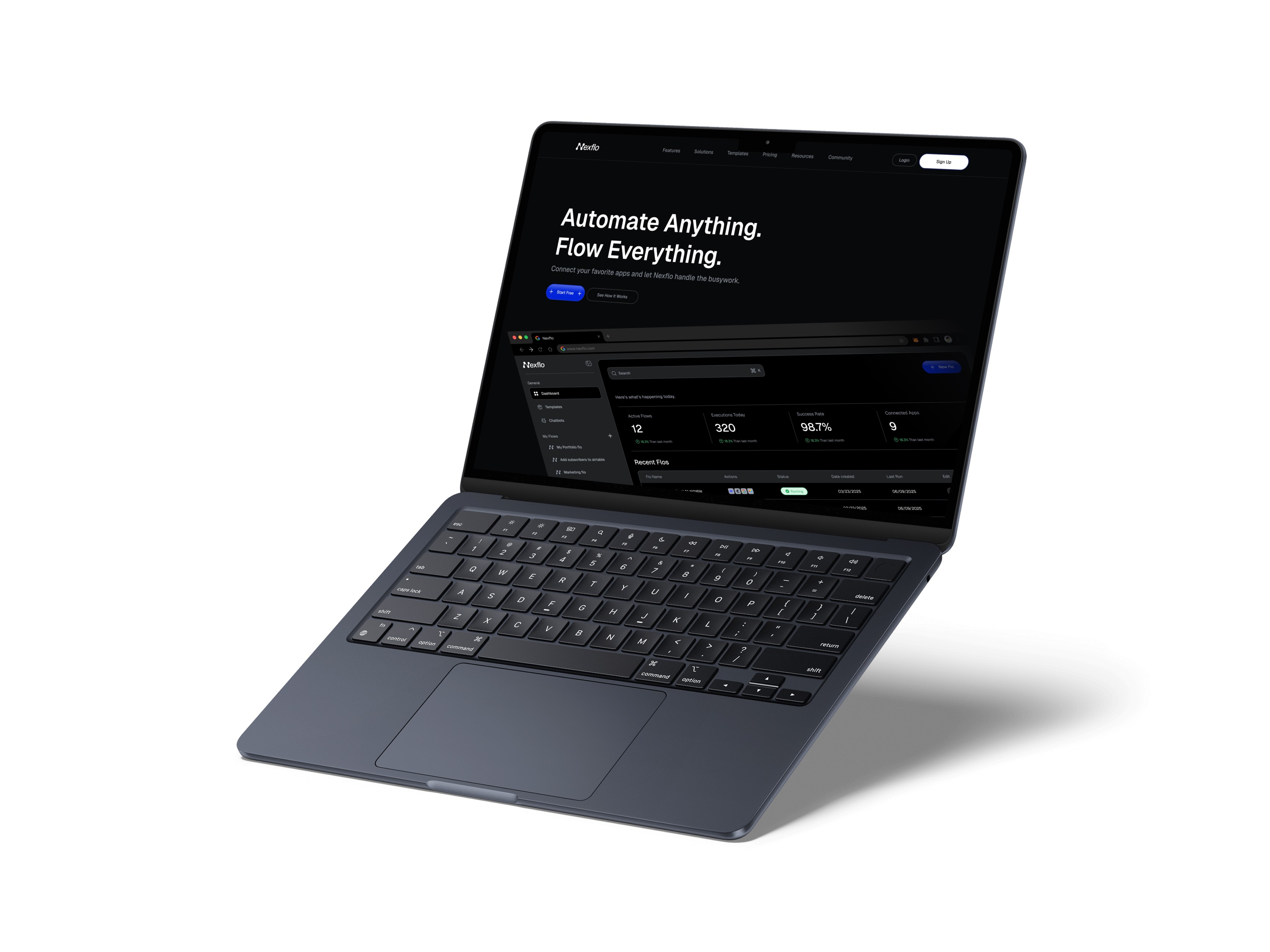
Nexflo is an automation platform designed to simplify the way businesses and individuals connect their tools, apps, and workflows. Similar to platforms like Zapier and n8n, Nexflo empowers users to automate repetitive tasks, streamline operations, and improve productivity without needing to write code.
With a focus on flexibility, speed, and ease of use, Nexflo helps users build powerful workflows that move data seamlessly across applications, trigger actions in real time, and eliminate manual work. Whether it’s syncing data between CRMs, automating notifications, or integrating payment systems, Nexflo ensures that workflows run reliably and efficiently.
Built with scalability in mind, Nexflo caters to both individual creators looking to save time and teams or businessesaiming to optimize their processes.
Landing page design
webflow development
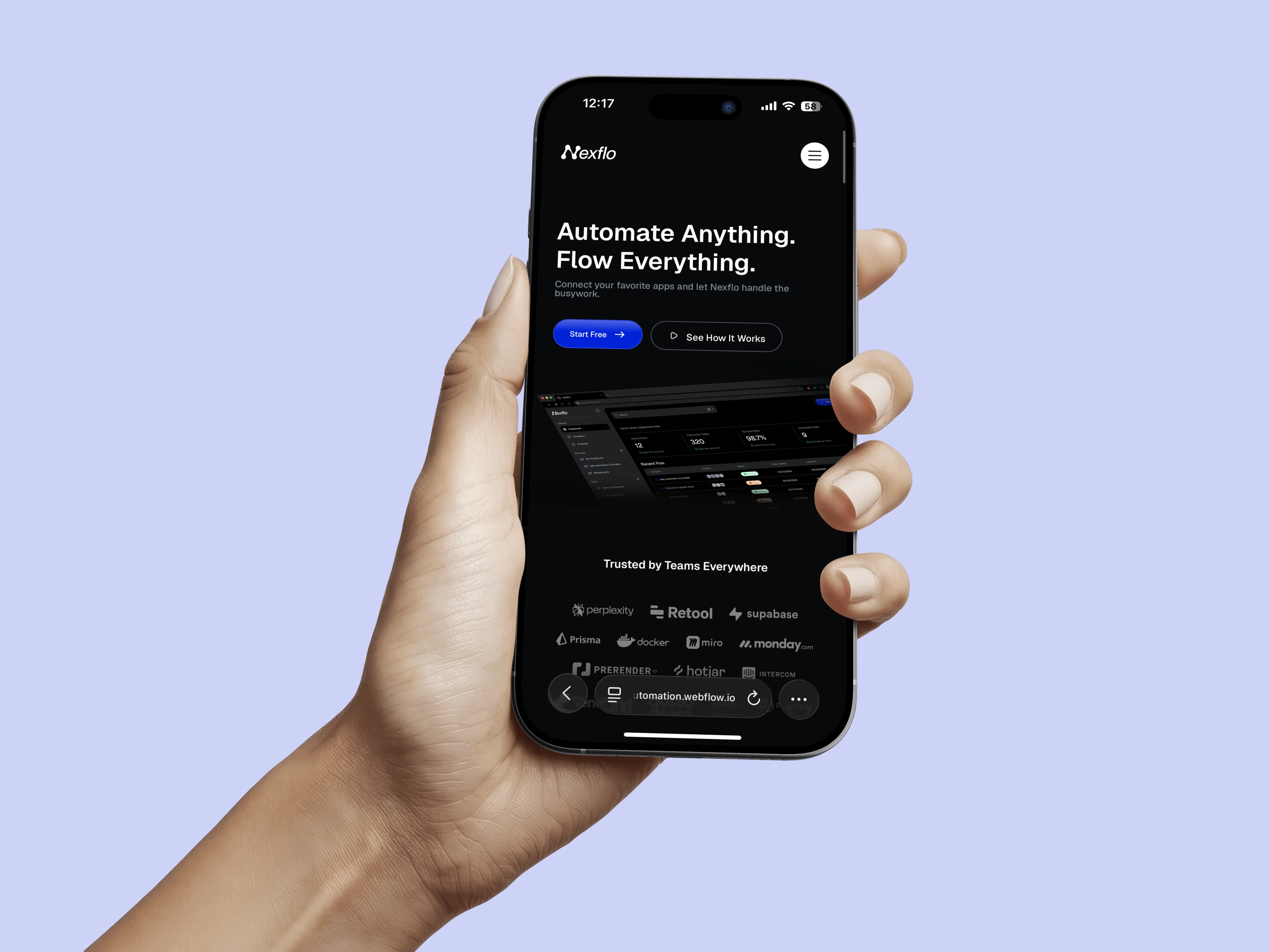
The challenge for Nexflo’s landing page was to design a clear and engaging experience that communicates the power of automation in a simple, approachable way. Since the platform caters to both technical users and non-technical teams, the goal was to balance **visual clarity with product depth**. Many automation tools struggle to explain complex capabilities without overwhelming users, so the landing page needed to educate, build trust, and drive sign-ups—all within a few scrolls. I focused on creating a **modern, conversion-focused layout** that highlights Nexflo’s core value: effortless workflow automation. Every section was designed to guide users smoothly from awareness to action, with clear messaging, intuitive visuals, and consistent branding that reflects simplicity and innovation.
The approach:
Defined core goals: Focused on creating a landing page that clearly communicates Nexflo’s value and drives user sign-ups.
Conducted research: Analyzed competitors like Zapier, Make, and n8n to identify design gaps, messaging patterns, and conversion opportunities.
Mapped the structure: Designed a conversion-focused layout starting with a bold hero section, concise product highlights, and strategically placed CTAs.
Established a design system: Built around minimalism, clarity, and consistency — using a clean color palette, modern typography, and simple iconography.
Prioritized user experience: Ensured intuitive navigation, logical content flow, and a balance between visuals and information density.
Implemented responsiveness: Optimized layouts for all screen sizes to maintain visual harmony and usability on mobile and desktop.
Focused on performance: Developed lightweight components with fast load times, smooth animations, and scalable code architecture.
Refined storytelling: Crafted copy and visuals that explain complex automation concepts in a simple, relatable way to build user trust and engagement.


